Making your app stand out in a digital marketplace is a challenge, to say the least. Creativity, striking the perfect balance between functionality and aesthetics are more important than ever. At MessApps, we’ve honed this craft we like to call ‘functional minimalism’. This design philosophy isn’t just about creating apps that look good — it’s about designing apps that feel good to use.
The Rise of Minimalist Design
Minimalism in app design is more than a trend; it’s a response to the overwhelming complexity of the digital world. It’s about cutting through the noise and delivering a clean, focused user experience. But here’s the million-dollar question: How do we ensure that stripping back doesn’t strip away the essence of an app’s functionality?
Beauty in Simplicity
The allure of minimalist design lies in its beauty and simplicity. By eliminating unnecessary elements, we allow the user’s focus to remain on the task at hand. In minimalist app design, every color, shape, and line serves a purpose, reducing cognitive load and making the app not only visually appealing but also more intuitive.
Functionality as the Foundation
While aesthetics are crucial, functionality is the foundation upon which we build. An app could have a stunning interface, but if users can’t quickly figure out how to use it, it will be deleted as fast as it was downloaded. The art is in the integration of design elements that are both visually appealing and functional. Every swipe, tap, and scroll should feel as effortless as it is engaging.
MessApps’ Approach to Functional Minimalism
At MessApps, we believe that the best apps are created at the intersection of innovative design and practical functionality. Our approach involves a few key strategies:
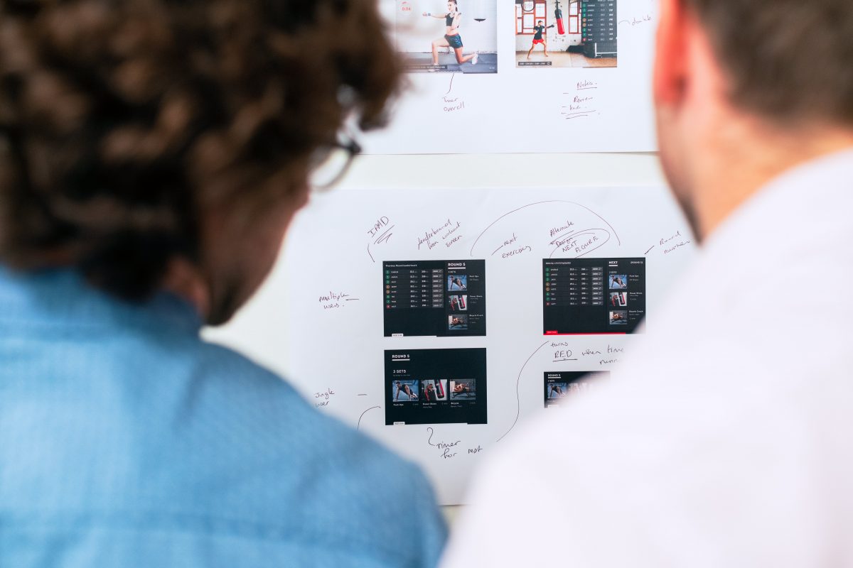
User-Centric Design: We start with the user in mind, creating wireframes and prototypes that focus on usability. Each design element must enhance the user’s journey, not detract from it.
Purpose-Driven Features: We carefully consider each feature’s purpose before it makes the cut. If it doesn’t serve a clear, useful function, it doesn’t belong in the app.
Streamlined Workflows: We map out the simplest path to complete a task, designing workflows that reduce the number of steps a user must take to achieve their goal.
Intuitive UI: A minimalist UI doesn’t mean bare; it means understandable. We create interfaces that are self-explanatory, where users can navigate with ease and confidence.
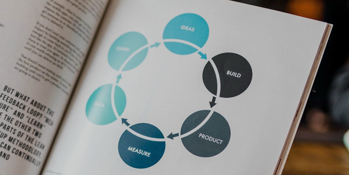
Evolving with Feedback: Post-launch, we listen to user feedback to refine and remove elements that may not be as functional as intended, keeping the app’s design fresh and focused.
The Proof Is in Our Portfolio
Our portfolio boasts apps for Y Combinator startups and Fortune 500 companies alike, each a testament to our ability to balance beauty and utility. By employing functional minimalism, we’ve helped our clients not only to capture their users’ attention but to hold it, delivering memorable experiences that drive engagement and retention.
In the artful dance of balancing functionality and aesthetics, minimalist design leads the way in modern app development. At MessApps, we’re not just developers; we’re modern-day artisans, crafting digital experiences that resonate with users by embracing the power of simplicity.
If you’re ready to transform your app idea into a minimalist masterpiece, let’s connect. Together, we can build something extraordinary.
