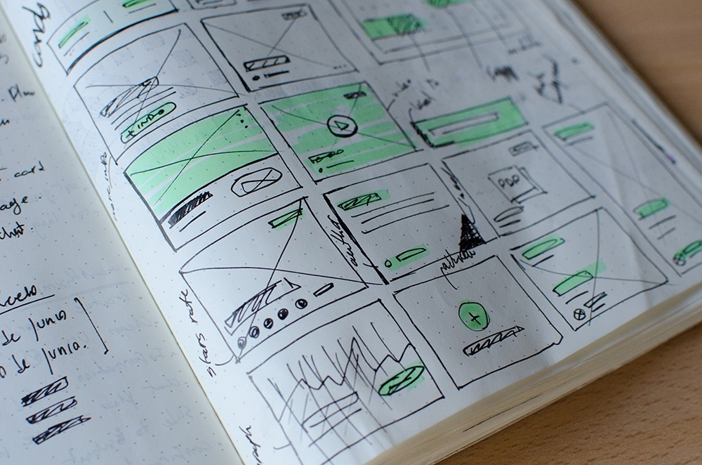
Your app is so much more than just a collection of pages, connected to each other and constructed for a particular purpose. It’s an interface, a platform, a tool, and a virtual space designed to meet a specific need, or promote a company, or provide solutions to an identified problem. As such, careful thought needs to go into the way the interface looks and feels – you want your audience to have a connection with your app, and for them to feel that it has been designed with their wishes, thoughts, or lifestyle in mind.
Here at Messapps, we always take great care to put across the idea that interface design isn’t some last-minute process, slapped on at the end of the project. The colors, fonts, style, and overall tone of your app need to be taken into consideration all the way through because they’ll not only inform the way the app comes together, they’ll also establish the way your target audience relates to all the content and usability within.
You know your audience better than anyone, and you know the kind of people they are, the way in which your app will be used by them, and the vibe you want to get across. This is why being selective with your design, and thinking carefully about the way you want your app and your company overall to come across, is absolutely key to your app’s success. Let’s take a look at a few tips and approaches to bear in mind when you come to this crucial part of your app’s creation.
Colour is Key
Make no mistake, the color scheme of your app is of the utmost importance, and says a huge amount about the nature of the app or the company it is promoting. You can find pages and pages of information on the meanings of colors, what they suggest, and the effects they have on your audience online (and we’d recommend putting in the time to do some research in this regard), but we’ll condense the main points for you here.
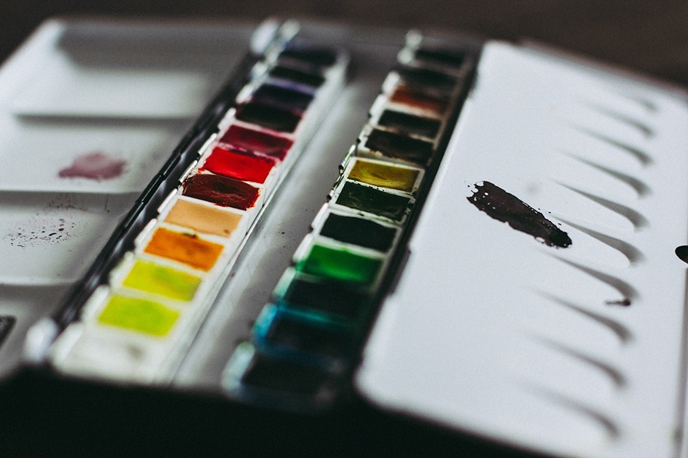
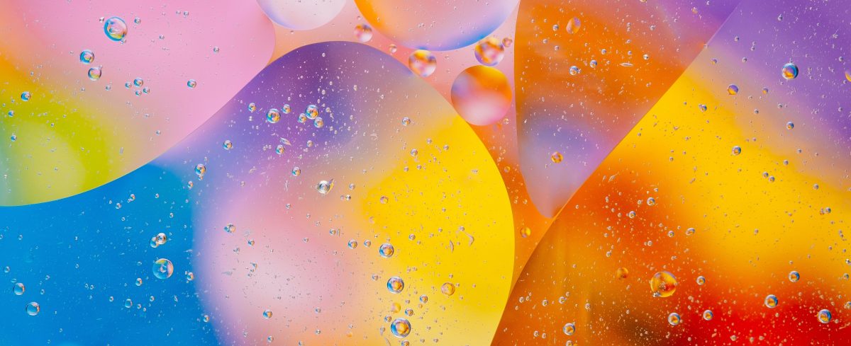
The first tip we’d really, really like to get across is this: don’t use a whole spectrum of colors and hues on your app. You’re a professional, and your app needs to come across as one which has been professionally designed. Start flinging more than four or five different colors onto your interface, and it’ll end up looking like it has been put together by a hyperactive preschooler… and it’ll give your user a headache within minutes of opening it. Choose just one, two, or at a push three colors which harmonize or contrast comfortably with each other, and you’ll be onto a winner. Here’s a quick rundown of what the main colors mean.
- Blue: Trustworthy, secure, and stable, blue is the color most preferred by legal and financial apps. It immediately suggests seriousness and a conservative approach and puts users at ease.
- Red: This one’s easy – we all know that red means passion, alertness, and urgency. It can also represent danger or stress, though, so should be used sparingly!
- Yellow: Happy and optimistic, and also slightly childlike, yellow is popular with entertainment or shopping apps, as it communicates a sense of hope and impulsiveness.
- Green: this color is usually associated with nature and tranquility. If your app is connected to an environmentally-friendly company, this might be a natural choice to go for. Green is also associated with health (which is why hospitals and dental clinics are usually painted in this color).
- Purple: Wisdom, success, and regality are the most common things associated with purple. It’s also often connected with the weird, occult, or magic, too. Purple needs to be used with a deft hand, though, as it doesn’t always come across very well on the screen.
- Orange: This color is often associated with cheap ‘n’ cheerful businesses, as well as those which are child-friendly, enthusiastic, and excitable.
- Black & White: Modern, slick, and professional, black and white are great colors for trendy companies looking to put across a minimalistic, confident aura.
Also we have a good useful information of how to design an accessible user interface for color blindness.
Choosing the Right Tone
Tone can mean different things to different people, but however you approach it, it’s something important to consider when designing your app. Consistency is what’s key: if your app is for a professional service or business, the whole app needs to reflect this (in the color scheme, in the words used, and in the formatting). The same can be said for apps designed to get people excited about an event or service – you don’t want to launch an app for a children’s entertainment channel, for example, which resembles an accountancy firm in its choice of wording or layout.
The best way to approach tone is to put yourself in the shoes of your users and target audience. If you were a customer, what impression would you like to gain from the app or the company behind it? Would you expect something sincere and professional, lighthearted and fun, or approachable and friendly? Use this as the basis for your app design, and be sure to have absolute consistency on every single page.
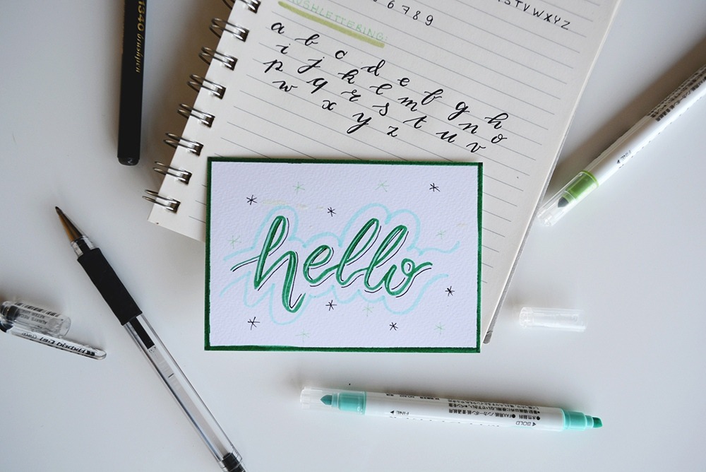
Fonts, Fonts, Fonts
The text makes up 95% of digital communication, and as a result, typography is really important when it comes to app design. Surprised? You’re not alone. We often don’t think too much about fonts when we’re using apps or at least that’s how it seems. In fact, subconsciously, fonts do have a considerable impact on how we receive the information they convey on the screen, and as such, a lot of time and money goes into both designing and choosing the right font for the right purpose.
Most newbies to the app design world might not give fonts much of a second thought (apart from the universal rule of ‘no comic sans’), but to overlook this would be a mistake. The font you choose says a lot about the app and the company behind it, and it’s well worth trialing a few different fonts to see which conveys the best ‘feel’ or tone.
One top tip which works as something of a catch-all when choosing fonts is to go for a native font. Apple’s native font – San Francisco – was meticulously designed for legibility, clarity, and slickness, as was Google’s native font, Roboto. Both are available to use, and there’s no need to worry about their legibility and usability on Android and iOS systems, as you can imagine millions went into their design! However, if you’re looking for something with more personality or a distinctive slant, there are plenty of options out there: just make sure that your font fits the tone of your app, is easy to read, and doesn’t end up crowding the all-important ‘white space’ of your app as a result of being used.
Keep it Stylish
It’s not easy to give advice when it comes to choosing the right style for your app. After all, your idea of what great style might be could well be different to ours. However, within that very conundrum lies the most important advice we could give: you need to remember that your app is not for you, it’s for your customers. As such, your own personal sense of style isn’t particularly relevant, especially if you want your app to have a considerable reach among your customer base.
Probably the best tip we can give is to apply a ‘timeless’ style to your app. Now, seeing as the app industry is barely a decade old, this sounds a little contradictory – could it be said there is a classic or timeless style in app design? At present, probably not but there definitely are plenty of looks and styles in app design which very quickly age, and look incredibly cheap and tacky just a year or so after their release. As such, it’s best to opt for something which isn’t connected to the whims of fashion or passing trends (unless your app is very much connected to a particular fad) and instead go for something sophisticated and understated, which has the legs to last the course.
Think of it as if you’re designing a kitchen for your house. The chances are you spend a lot of time in your kitchen. It’s a functional room in your house, with a specific purpose. It’s also the place where you probably congregate with your friends when you’re having a get-together or a party. As such, you want a style for your kitchen which is comfortable, easy-on-the-eye and doesn’t look outdated in a matter of months. For your app design, take the key elements of your company colors or your services, your logo, your message, and your tone… and distill them into something elegant, something approachable, and something which puts usability and functionality first. Substance and style are not polar opposites, they’re harmonious features and need to be treated as such.
Well, there you have it – a handful of top tips from Messapps regarding great interface design. We all know what a great app looks like, just as we all know what our customers want. Our job as app designers is to find the meeting point between the two and make it work for those who matter most.
Related Posts

Color blindness is the common term for a condition where individuals often mistake shades or lose their ability to distinguish colors at all. Women are less likely to have this disease when approximately every twelfth man is prone to it. In the article, I tried to gather and summarize notes of designers and developers about … Continue reading “Color Blindness: How To Design An Accessible User Interface”
Each platform has its own personality. It’s always best to design elements that are cohesive to the platform’s personality as this will make your app feel right at home. It makes the app easier to learn from your customers as they will be familiar with the flow from using other apps. Like every piece of … Continue reading “Overview Of iOS Design Guidelines”

When you create an app, think about all the details. If you want your app to assist, bring money, and work for your audience, you need to intensely nurture it at the idea stage. Tip 1: Create a trial version Create a trial version with in-app purchases or an option to subscribe to a premium … Continue reading “4 Tips to Engage Your App Users”
When it comes to making a powerful impression and pushing the identity of a brand, color is key. Just look at some of the most iconic color combinations of the world’s most famous companies – Coca Cola’s red and white, IKEA’s blue and yellow, McDonald’s ‘golden arches’ – the list goes on and on. These … Continue reading “Psychology of Color in UI Design”