After you figure out what you want your app to do and who you want it to be for, the next step is getting a rough idea of how it will look and work. For this, you make a mockup, a black and white outline for all of the screens in your app, with all of the buttons and as much of the text as possible.
Final mockups should be done by a professional, but you can get off to good start with the template in this article. It will help you understand how your app translates from an idea formulated in words, to an idea formulated in screens on a smartphone. You will get to see how your app looks in the screen-to-screen layout in which it will actually be presented. You might see things that look great and decide to add some more of them, or you might see that there is not enough room on the screen to add in all of the buttons and features you want.
A mockup is a great tool for critically evaluating your own idea. You may find that your idea is not actually feasible. Sometimes the only way to illuminate the issues with your app idea is to actually write it out on screens as a user would experience it.
Another great reason to do this is that it allows you to get opinions from people on a real concrete idea. Instead of giving their opinions on your pitch, they can give opinions on an actual set of mocked up screens. This is ideal because going through a mockup for this first time is much closer to what a user would be doing when using your app for the first time! It will also be convenient during the initial phases of the development process, as you will be able to show your developers something concrete while explaining your idea!
When using this template to build a mockup, your main focus should be airtight logic. Basically, logic equates to thoroughness. There should be no missing screens, no ways to get stuck on a screen, no island screens that have no buttons leading to them, and so on.
Here are 5 mistakes that are easy to make when doing mockups:
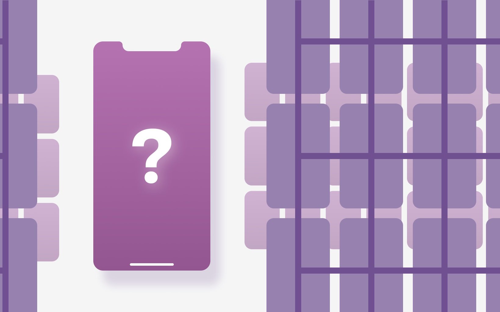
Mistake 1: Leaving out screens
This is an obvious one. It is a problem because your mockup is supposed to include a representation of every screen that will be on your app. If it is missing screens your mockup is not complete. That confirmation screen after login? Yep, you need it. The reset password screen? You need that one in the mockup too. Even if the background screen is the same, any change to the picture requires its own separate representation in the mockup, and it is considered a separate screen. When you are making your own mockups, including things like Terms and Conditions and confirmation screens will not be as important. But, when you get a mockup done professionally, make sure you are getting every single screen, according to the definition above.

Mistake 2: Including buttons that don’t lead anywhere
Anything that will not be on the app, should not be in the mockup. All of your buttons and screens should be connected in a logical way
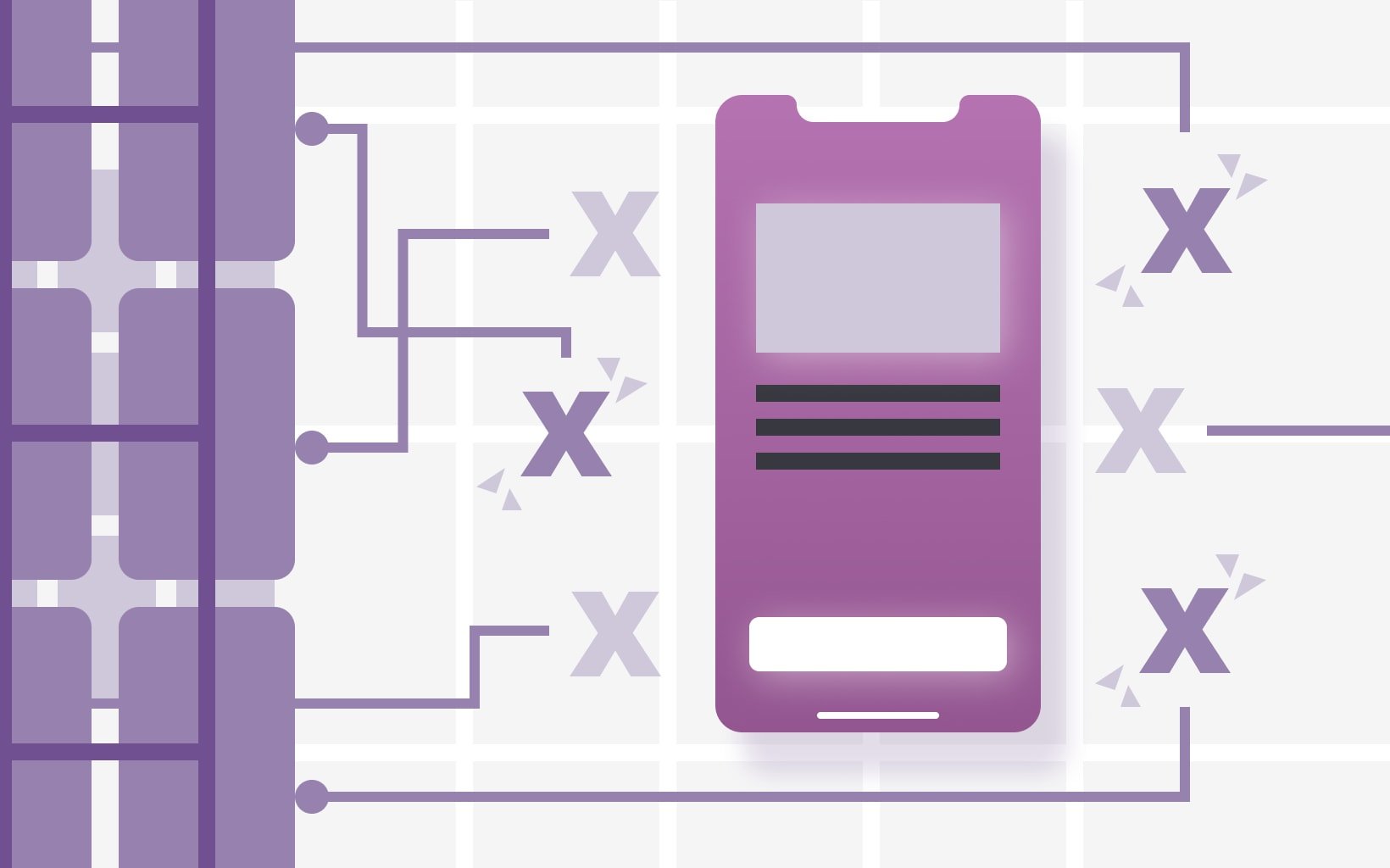
Mistake 3: Including screens with no way to get to them
Make sure you mentally run through all possible user actions within your app. This will help you to keep all of the screens connected. When you imagine changing the settings and realize there is no way to get to that screen, you will see that you have to add some buttons in!
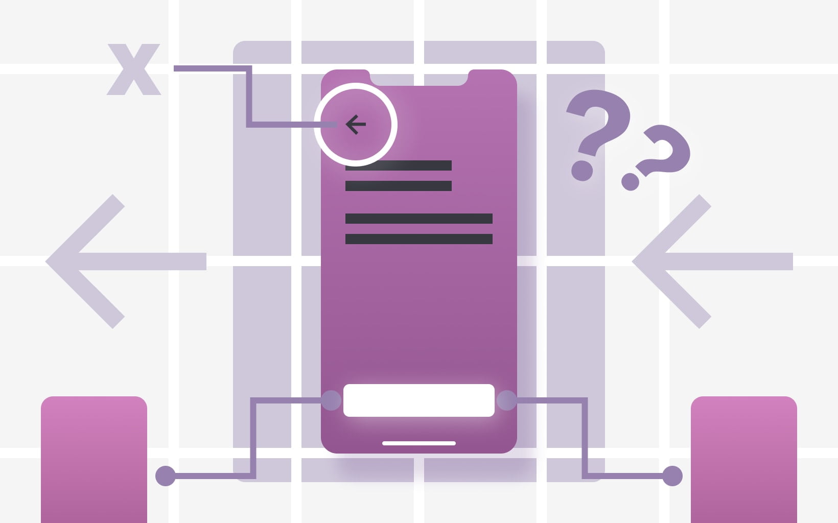
Mistake 4: Including screens with no way to navigate away from them
Imagining the full tree of user behaviors is also useful for detecting sticky screens. If you add a button to get to your settings screen, there has to be a button to leave the screen also. This might not just be a back button either, it could mean an extra icon for all of your screens. This touches on another of the values to make a mockup, which is that you can make sure your screen is not getting too cluttered.
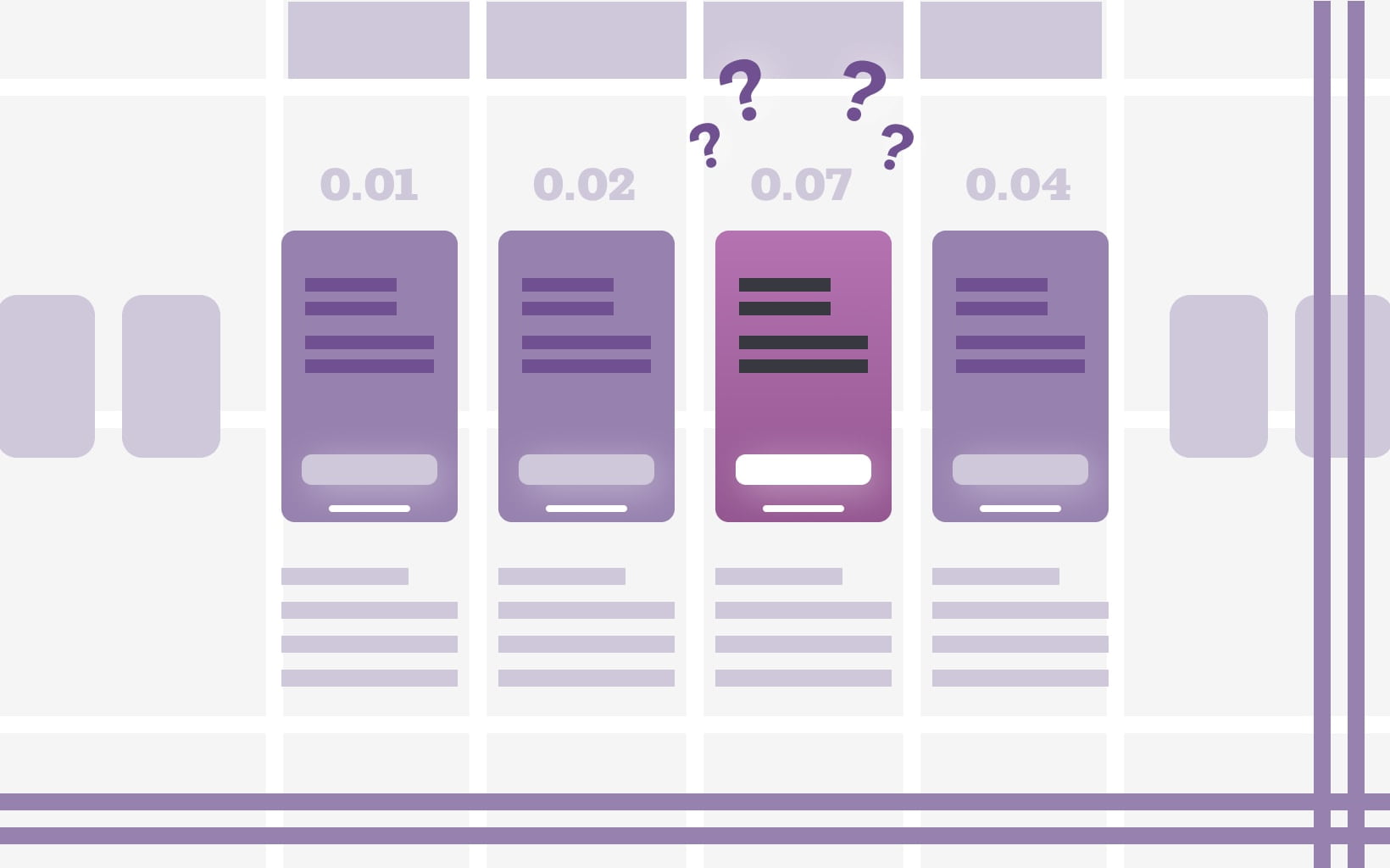
Mistake 5: Failing to number pages
Numbering pages is a great way to keep your mockup organized and ensure good logic and flow. The pages should be numbered in a sequence that is representative of the user’s behavior when using the app. The mockup screens should be numbered in the order users would see them. The first screen users see should be page 1. If you have to go through the homepage to get to the profile, the homepage should be a lower number. This is intuitive but easy to mess up. When you reach intersection screens, and there are a number of different paths the user could take, you will have to assign numbers semi-arbitrarily. In these cases, try to start with the screens most central to the app, with the most buttons leading to other screens.
With the help of these tips, you can build a killer mockup that will help you to critically evaluate your app idea and hone it even further. Making a tangible, screen-by-screen mockup will also help you understand your own idea more fully. It is a very useful tool, and a key step to becoming a successful Appreneur.

