Here at Messapps, we pride ourselves greatly in our ability to create the perfect custom apps for all our clients, no matter how specific their demands and needs, and no matter how unusual or outlandish their requirements or business model. By taking into consideration every aspect of the client’s MO, and taking the time to understand their target audience, what the application will be used for, and how it can be maximized with the correct features and tools, there’s no end to what we’re able to achieve.
When we were approached by Runon, we were immediately fascinated by the ingenuity and unique nature of this startup and the healthy app they had in mind. This company was on a mission to make daily exercise and jogging more interesting and enjoyable, and had a truly groundbreaking idea as to how they could integrate a key smartphone feature into their app’s function, in order to produce something really very different to anything we’d come across before.
An unusual idea called for an unusual app
Naturally, any app which calls for something unusual or unique is going to come with its own set of challenges. Runon’s idea was to create a running app which their users could open while out on their daily jog, and which would allow them to listen to a story of their choosing in order to make their exercise routine more enjoyable.

Now, there’s nothing particularly unusual about that – indeed, there are plenty of apps out there which do more or less the same thing. Runon’s unique angle, however, was to make the stories being told adapt to the heart rate of the user. As such, when the user would be running faster (and their heart would be pumping and beating more quickly), the level of tension and drama etc in the story would be intensified. This injects a fascinating and highly enjoyable angle to an otherwise fairly run-of-the-mill app, and certainly makes it stand out from the crowd to an audience who are constantly looking for the next level in usability, gamification, and enjoyability. Needless to say, we were hooked from the very first consultation, and quickly set about brainstorming how we’d go about turning this idea into a highly successful and efficient application for a growing market.
The challenge
The key challenge we faced with Runon’s app was how to bring together its key components. On the one hand, there needed to be a story (which is selected by the user) feeding into the user’s headphones. On the other, that story needed to be influenced by the user’s heart rate. Our mission, therefore, was to find a way of sending the user’s heart rate into the app, and making sure it influenced the story appropriately in order to heighten their running experience.
How did we achieve this? Thankfully, the wealth of modern technology available to us, as well as Apple’s interconnected devices, made the solution relatively straightforward. We found that by connecting the Apple Watch heart rate monitor to the app, we’d be able to feed live heart rate data into the app itself, which would then be able to trigger the algorithms which organized the sections of the story the user would hear. As such, the increased heart rate of the user would automatically select the next chapter from the database within the app, resulting in the desired effect the client was seeking.
Keeping things straightforward
Once we’d figured out how to work with the basic function and raison d’etre of the app, we were able to turn our efforts to the other key aspects of the app, and apply our signature attention to detail in order to deliver a truly superb product.
We wanted Runon’s app to be incredibly simple to use. One of the first things we identified when exploring how to create this app, was that users who were setting out for a jog were not going to want to mess around with various screens and buttons before starting their exercise. As such, we stripped things right back, and used a minimalist UI with an absolute focus on the content. We wanted users to be able to press one button, which would trigger the story they’d listen to, and then be free to start running and enjoying the app’s function.
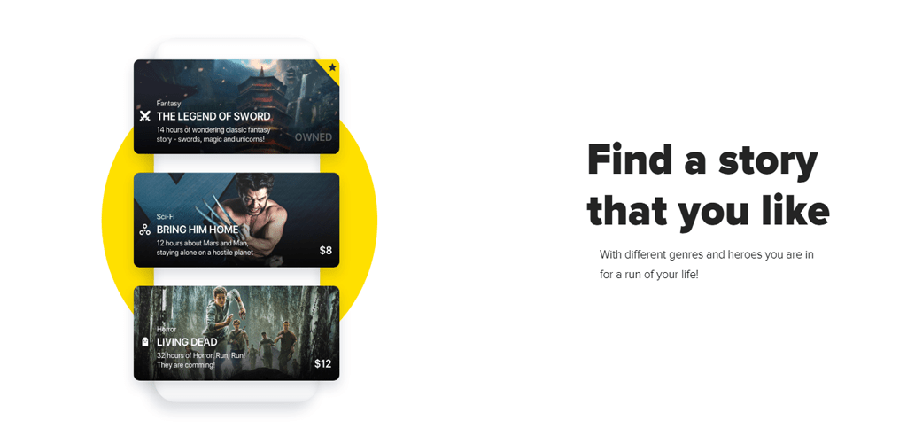
Once the user had found a story they’d want to listen to (and there was a great range of genres, hero types, and storylines to choose from), they’d simply tap the start button… and that’s all there is to it. While jogging, they could check their phone to see their progress, which is shown on the screen while the app is open.
Cool extra features for greater usability
Of course, because this is essentially an exercise app, there needed to be some interesting and helpful features for the user to explore either while they were mid-jog, while they were taking a breather, or once their exercise had finished for the day.

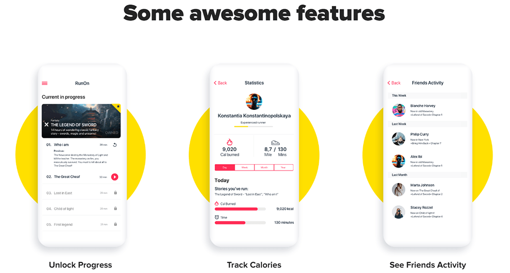
As a result, we decide to include a handful of simple, elegant, and straightforward sub-screens and features to the app, in order to boost its usability not just as a storytelling device, but also as a workable exercise app and enjoyable social experience. We added an ‘unlock progress’ button, which heightened the experience of using the app as was intended, and also a screen on which the user could track how far they’d run, and how many calories they’d burned as a result of their exercise. On top of this, we also added a social element to the app in the form of a ‘see friends activity’ screen. With this, the user would be able to see which stories were popular in their network, and check out how their friends and fellow users were getting on with their app thus boosting engagement and enjoyability.
Working with branding
We loved working with the branding of Runon. The sleek, modern, minimalist look they were after fitted in perfectly with our vision of what a high-quality healthy app looks like in the 21st century, and we agreed on the company’s signature colour scheme of yellow, white, and black – dynamic, energized, and distinctive.
We also decided to make full use of the brand name in the usability of the app. The ‘on’ in the brand name Runon became the button which could be pressed to start the app function, which added to the sleek image of the platform as a whole.
Through working with Runon and creating this fascinating, unusual, and user-focused app, we were able to address certain challenges head-on, and demonstrate how our skill and experience in custom app creation could lead to truly fantastic results. If you’re looking for a custom application for any purpose, industry, or user type, we have no doubt that we have what it takes to deliver the goods for you. Want to find out more interesting app cases? Get in touch with Messapps today!


