
Color blindness is the common term for a condition where individuals often mistake shades or lose their ability to distinguish colors at all. Women are less likely to have this disease when approximately every twelfth man is prone to it.
In the article, I tried to gather and summarize notes of designers and developers about designing for colorblind people. But before discussing user interfaces, how we distinguish colors at all?
RGB in your Head
There are several theories of color perception and we are going to consider the most popular one. According to it, the human retina has three special cells called cones. Everyone is responsible for one part of the color spectrum: red, green, and blue. Cones react to light and forward information about its environment to the brain. There, all data is received and added together to produce the colors we see; just like in the RGB color model! Only humans have a wider coverage of colors than any existing standard of this model. Humans aren’t actually unequivocal in terms of color; we don’t share the exact same color vision experience. Because the human eye and brain work together translate light into color, each of us sees colors differently. Your blue can be slightly bluer than someone else’s. However, sometimes differences in color vision are tragic.
An estimated 253 million people live with vision impairment: 36 million are blind and 217 million have moderate to severe vision impairment.
Defects of the cones lead to worsening of the color vision. Depending on the seriousness of the defects, a human can mistake shades or lose the ability to distinguish colors at all. For the majority of people, the disease is genetic. The most common types of color blindness are due to the loss or limited function of red or green cone photopigments. This type of color blindness is commonly referred to as red-green color blindness. For example, in people with deuteranopia, there are no working green cone cells, which means that they are unable to see not only green but also the constituent colors with it. The same is with protanopia, but in this case, the individual has no working red cone cells. Blue-yellow color blindness is rarer than red-green, and an even rarer type of color blindness is called monochromacy (or complete color blindness). Monochromatic people don’t experience colors at all, they distinguish colors only by brightness. In other words, they see the whole world in black and white. But why is it so important for user interface designers?
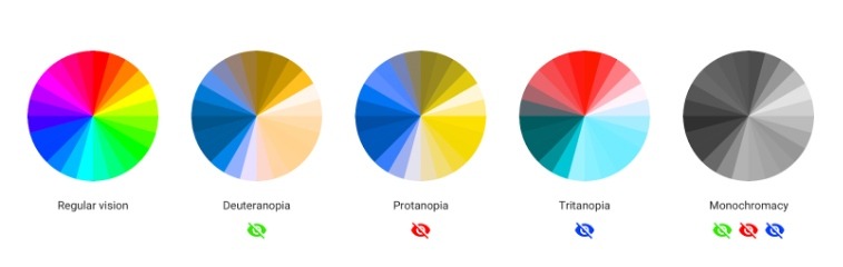
Comparison of the perception of the color wheel by people with different types of color blindness. These specific disorders and other color blindness is simulated by using the service Coblis
Every type of color blindness causes inconvenience; this carries over to the user experience. At worst, colorblind people cannot use a product at all. It’ll upset a lot of users and a business will lose potential clients too. To avoid this, we need to remember only a couple of simple rules. Here a nervous designer cowers, “I need to design a site from scratch in one week,” the designer says. “and you give me another problem to solve? I don’t have time for this!” Don’t worry, it’s not so bad.
Black and White Contrast
It’s important to understand that colorblind people see the same colorful picture as the rest of us. Despite an inability to see some colors, colorblind people distinguish shades even better than average. Back in 1940, scientists found that colorblind individuals notice camouflage where a human with normal vision can’t see it.

Is it true that a monochromatic can't enjoy the same views as others?
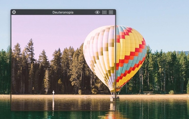
What colorblind people can’t always do well is distinguish tones (red, yellow, blue, green, etc). People with regular vision and people with protanopia see the same image. In the eyes of the colorblind, the flower and the background are almost in the same color. And if we talk about user interfaces, such perception leads to a bunch of problems: text becomes unreadable, call-to-action buttons inconspicuous, etc.

Comparison of the perception by a human with regular vision versus a human with protanopia. The red completely disappears in the photo on the right
Recognizing objects, colorblind people rely on the luminance contrast. One way or another this contrast exists in any color palette, but it can be either sharp or muted. The more muted it is, the more difficult it is for the colorblind to distinguish colors.
The luminance contrast is easy to control if you hold-back with color in the initial design stages. You can design a user interface in grayscale and saturate it. This approach helps you primarily focus on user experience design as well. It isn’t a bad idea to discolor the finished interface for the final check.
You can do this by using the Black & White adjustment layer in Adobe Photoshop. The look of the app on one page or screen should be enough to make a conclusion about the entire product. For an accurate contrast check, you can use the free tool, Color Contrast Check. Also, there is a paid MacOS application called Contrast that does the same offline. Both tools take into account the international standard Web Content Accessibility Guidelines. The WCAG documents explain how to make web content more accessible to people with disabilities. Although these tools will most certainly help, you should not solely pay mind to colors.
You Can’t Trust Colors
Color isn’t omnipotent, you shouldn’t expect that it can solve all of your problems alone. But with a proper base color is able to beautify UI and improve UX.
Statistically speaking most people with a moderate form of red/green color blindness will only be able to identify accurately 5 or so colored pencils from a standard box of 24 pencil crayons.
Any color designation can be supplemented with a caption or an icon so that the object preserves its function no matter what happens with colors. For example, because protanopia leads to an inability to see red color, it becomes difficult to correct form if a designer uses only red to indicate mistakes. A better solution is to supplement color with a caption or an icon.

In addition to color, Square uses an icon to point out mistakes
Sometimes it’s a good idea to add patterns and textures to emphasize the contrast between objects.
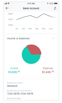
In Messapps, we added dashed lines to the pie chart in Vola app
Developers tend to make colorblind modes in the settings for that; that’s how Trello, Two Dots, and others do it.
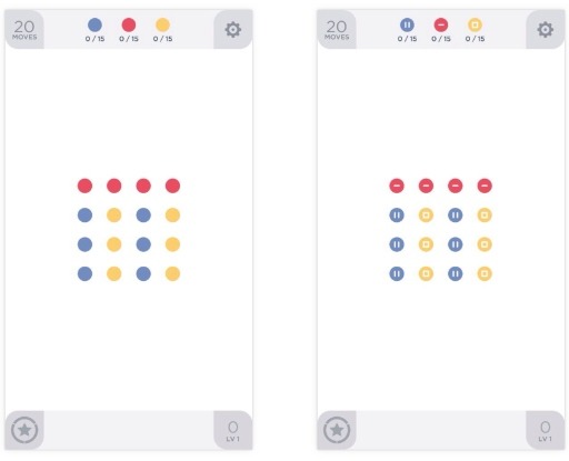
iOS Two Dots regular and colorblind mode
Of course, every pattern and texture brings a lot of noise, so it’s better to avoid them. Slack, for example, offers users special accessible themes that change all colors of the user interface.
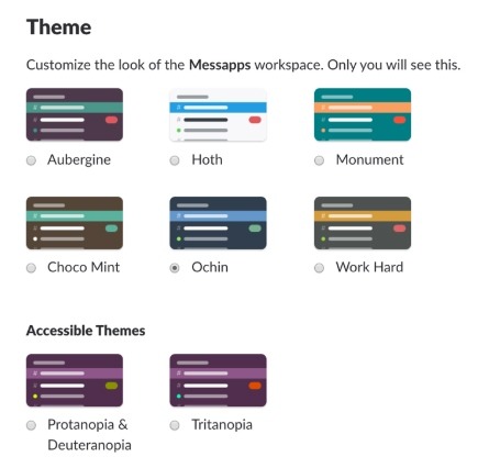
In Slack, you can choose one of the preset accessible themes
Care about all
The development of an accessible user interface doesn’t require a lot of additional time, and the final product will be easy to use for both categories of people: colorblind people and people without any visual impairment.
Bonus
I want to highlight some useful tools I didn’t mention before.
Sim Daltonism for iOS and MacOS lets you visualize colors as they are perceived with various types of color blindness. Use the camera on your iOS device, and use the Mac app to filter a region of the screen. Both applications filter everything in real time. For the specific images, you can use an online tool called Colblindor. There you can also find the Ishihara test to check for red-green color blindness.
Screenshot of the Sim Daltonism application from the Mac App Store
In Adobe Photoshop there is a built-in function that allows you to see the canvas through the eyes of colorblind. To use it go to View —> Proof Setup —> Color Blindness —> Protanopia-type/Color Blindness – Deuteranopia-type. Now you can turn it on and off by using ⌘+Y key shortcut on a Mac and Ctrl+Y on a PC.
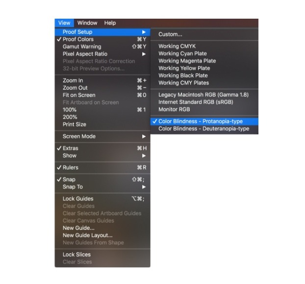
Adobe Photoshop accessibility sequence
If that’s not enough, there are a lot of extensions for browsers too. For example, NoCoffee for Google Chrome.
Related Posts
Your app is so much more than just a collection of pages, connected to each other and constructed for a particular purpose. It’s an interface, a platform, a tool, and a virtual space designed to meet a specific need, or promote a company, or provide solutions to an identified problem. As such, careful thought needs … Continue reading “Top Tips for Great User Interface Design”
When it comes to making a powerful impression and pushing the identity of a brand, color is key. Just look at some of the most iconic color combinations of the world’s most famous companies – Coca Cola’s red and white, IKEA’s blue and yellow, McDonald’s ‘golden arches’ – the list goes on and on. These … Continue reading “Psychology of Color in UI Design”

Material Design is a design language created by Google. Initially, it was announced on June 25, 2014, at the Google I/O developer conference. Before it was officially dubbed “Material Design”, employees referred to it by the codename “Quantum Paper”. With Material Design paper becomes a metaphor; the aesthetic represents a flat sheet of floating in … Continue reading “What Is Material Design?”

Each platform has its own personality. It’s always best to design elements that are cohesive to the platform’s personality as this will make your app feel right at home. It makes the app easier to learn from your customers as they will be familiar with the flow from using other apps. Like every piece of … Continue reading “Overview Of iOS Design Guidelines”