Each platform has its own personality. It’s always best to design elements that are cohesive to the platform’s personality as this will make your app feel right at home. It makes the app easier to learn from your customers as they will be familiar with the flow from using other apps.
Like every piece of software, iOS has its own themes that set it apart from the rest. If you want your product to topple the charts on the Apple App Store, these are the themes that you need to take into account:
- Clarity
Throughout the app, everything is legible, clean, symmetrical, and organized. Each function serves a purpose, and each function is easy to navigate. There should be no ambiguities regarding app functionality. The use of space, color, graphics, and interface elements help stage important content.
- Obedience
An interface that submits does not fight back. The user is in control. This isn’t a “Tesla takes the wheel situation,” giving the user control of what they came for. Gradients, intense shadowing, and frames, 9 times out of 10, distract the user from what’s important and fail to even perform what they were set to today which was look pretty.
- Depth
Visual layers give the app a realistic motion. Touch gestures add to interactivity and a screen becomes more than just a screen, it becomes a command center. Smooth transitions also heighten interactivity and give the user a sense of floating from function to function.
Now that you know the style of iOS commands it’s time to break down what goes into these three themes.
Proper Layout
Your users want the ability to use the app in any context. iOS is one, but Apple devices are many. And your device respects how you hold it; turning it to the side doesn’t mean your head must also follow at 90 degrees, the device is kind enough to flip the image on the screen for you.
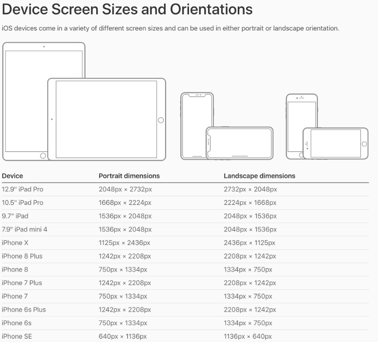
Source: CastFox Tech Blog
Be sure to take into account these dimensions when you’re designing elements and laying them out.
Sensitive to the Touch
Buttons are the name of the game here; they initiate actions and can be represented in the form of text or a simple symbol. Fortunately, Apple includes a number of ready-to-go commands for most cases if you’re not up for designing them yourself.
For more on how to implement these easy-bake buttons, see UIButton.
Get that Type Right
The native system typeface for iOS, San Francisco (SF), is ever so pleasing. This typeface will ensure clarity and legibility. You may use whatever typeface you desire of course, but San Francisco is a good tried-and-true default.
Here are three of the most important things to weigh in when considering type:
- Use type to highlight the important stuff
Combine type weight, size, and color to make prominent things pop and lesser things fall into the shadows (but not too much!). - One typeface to rule over all
Don’t get too crazy. With millions of unique typefaces out there your inner artist might want you to get real creative. But hold back. Mixing various typefaces will make your app look sloppy and that is certainly not one of the iOS design themes. - Why create when it’s already supplied?
Built-in text styles are based on system fonts and give you benefit over custom fonts as they take advantage of key typographic features such as Dynamic Type, which automatically adjusts tracking and leading for every font type.
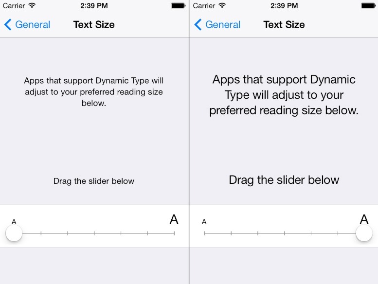
Source: HackMD.io
Paint the app
Color can convey messages without the use of words. It’s a great way to communicate the importance, failure, and completion.
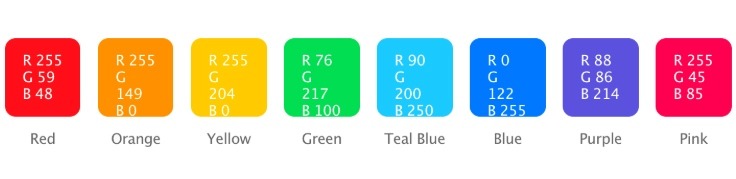
Source: icons8.com
iOS system colors
Here are some important things to note when choosing the colors your app will feature:
- Colors for communication
In terms of design, the less color you use is more. For example, a red symbol in an app will hold more weight and significance in terms of something being wrong, when the rest of the app omits the use of red for non-critical reasons. - One key color is key
iOS system apps each take one color to represent interactive elements effectively. For example, all the key interactive elements in the Notes app are denoted in yellow. When a user sees a potential function in a certain color, he/she does not have to think twice about whether or not it is, in fact, a function.
The More Pixels the Better
The iOS system is based on measurement points that translate to pixels. With standard resolution screens, one point = one pixel; higher resolution screens hold a greater number of pixels. However, the physical space on-screen still remains the same, the pixels are just more densely populated on the screen. Therefore, a higher resolution requires images with a greater amount of pixels.
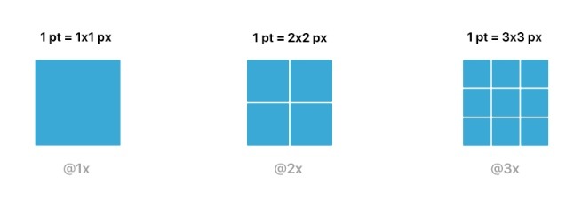
Source: Sympli
During design, depending on your iOS device, you accomplish high-resolution images by multiplying the pixels in the image by a scale factor. The standard resolution has a scale factor of one and is known as @1x, high-resolution images have a scale factor of @2x or @3x depending on the device.
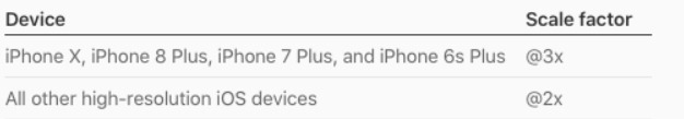
Scale factors for various iOS devices
Shouldn’t Need a GPS to Navigate
Navigating through an app is expected to be a seamless process. People never seem to think much much of it until something doesn’t feel right or they find themselves deep inside the app, trying to retrace their steps, but having to take emergency measures and restart.
To avoid this scenario, follow the three main styles of navigation that iOS makes use of:
- Hierarchical Navigation
One choice per screen until you arrive at your intended destination. If you need to go back, simply retrace your steps.
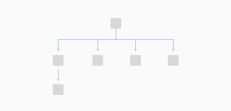
Source: SAP Experience Community
- Flat Navigation
Switch between content categories. Any store or music app will generally take on this style.
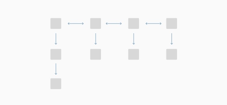
Source: SAP Experience Community
- Content defining the navigation
This style is more free-spirited. You learn how to navigate as you go along. Exceptionally interactive apps such as games make use of this type of navigation.
Source: Tencent
Conclusion
Following a platform’s design guidelines will only benefit metrics such as user retention and customer satisfaction. Your users will feel right at home as opposed to in some foreign country as they use your app. In order to gain a following, instilling comfort is a must. Cozy users up, and they may just make a permanent residence in your app.
For more information on how to design for iOS see Human Interface Guidelines.
Related Posts
Material Design is a design language created by Google. Initially, it was announced on June 25, 2014, at the Google I/O developer conference. Before it was officially dubbed “Material Design”, employees referred to it by the codename “Quantum Paper”. With Material Design paper becomes a metaphor; the aesthetic represents a flat sheet of floating in … Continue reading “What Is Material Design?”

Color blindness is the common term for a condition where individuals often mistake shades or lose their ability to distinguish colors at all. Women are less likely to have this disease when approximately every twelfth man is prone to it. In the article, I tried to gather and summarize notes of designers and developers about … Continue reading “Color Blindness: How To Design An Accessible User Interface”
When it comes to making a powerful impression and pushing the identity of a brand, color is key. Just look at some of the most iconic color combinations of the world’s most famous companies – Coca Cola’s red and white, IKEA’s blue and yellow, McDonald’s ‘golden arches’ – the list goes on and on. These … Continue reading “Psychology of Color in UI Design”
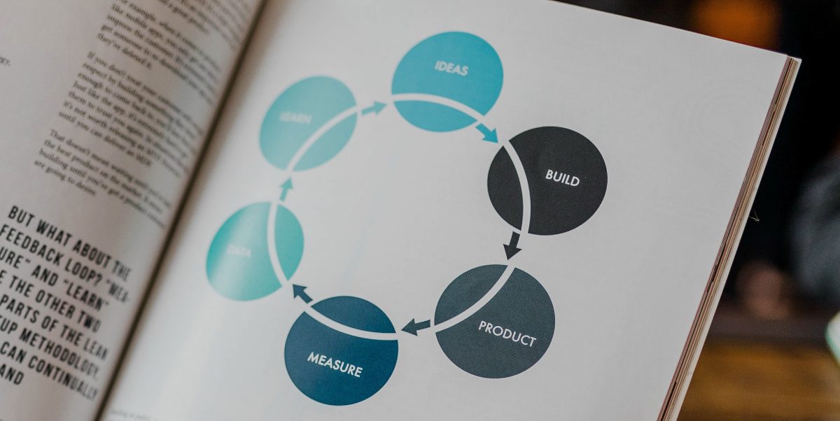
An app’s development cycle can be broken down into these five distinct steps 1. The idea When forming your next big app idea, remember that you are selling a product via a highly saturated market. Statistically speaking, it’s highly unlikely that one, if not multiple app developers have yet to ponder or even publish an app that’s similar to your … Continue reading “App Development Cycle: A Complete Overview”