iphone x dark

Idea

The goal of RunOn is to make running fun and interesting. The client wanted to engage runners by streaming stories which plot is tied to the heartbeat of the user.

Challenge

The biggest challenge for the project was sending users' heart rate to the app and making sure it will influence the storyline.

Results

We've connected Apple Watch heartrate monitor to the app to have live heart rate data. This, in turn, we've connected to our storyline database and allowed next part of the storyline to be chosen by the heart rate range.

WIREFRAMES

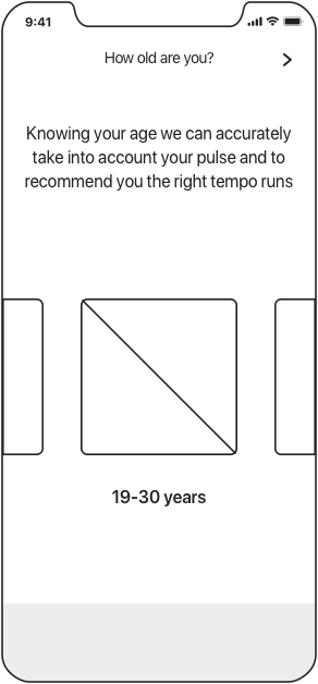
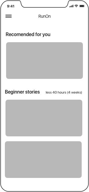
RunOn is an interesting application in that most of the time when it is used our user would not actually look at the app. Our users would be running. Hence, the goal was to make an easy to use interface that would allow users to easily re-engage with the app when they stop.

alt

Onboarding

alt

Connect Apple Watch

alt

Facebook Login

alt

Age Choice

alt

Story Library

alt

Story Info

alt

Reminder

alt

Active Story

alt

Next Chapter

alt

Overview

DESIGN

Goal

The goal of the application was to introduce stories in a colorful format and make the interface be easy to use on the go. This called for minimalistic UI with focus on the content.

How we achieved it

RunOn consists of cards that represent different stories. User can initiate a running story with just two steps:

1. Find a story
2.Tap on start button and start running!

iphone x dark iphone x 2
iphone x 2 iphone x dark

Some awesome features

pop-up1

Unlock Progress

pop-up1

Track Calories

pop-up2

See Friends Activity

Find a story
that you like

With different genres and heroes you are in
for a run of your life!

kard

See progress
while running

The running screen contains only the essential
information like pulse, distance, and chapter progress bar.

kard

BRANDING

App Icon

The icon for RunOn represents it's
name and plays with the idea of pressing
the "ON" button to start running.

kard

Typography

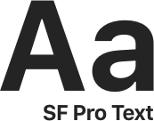
Minimalistic interface calls for similar fonts.
That's why we went with Apple's
San Francisco font.

kard
kard
alt
Download this app:
download